
Bright Future Parenting
My Contributions and Role:
Lead UI/UX Designer and main researcher, in charge of designing a mobile app and responsive website from identifying needs to the final product.
Responsibilities:
Ideation and Requirements Gathering
User Research & Competitor Analysis
Wireframing: Mobile and Desktop
Low-Fidelity Prototypes: Mobile and Desktop
High-Fidelity Prototype: Mobile and Desktop
User Interface Design
Designing for Accessibility
Usability Testing and Final Validation
About Bright Future Parenting
Bright Future Parenting is a mobile app that provides extra support to parents. It connects parents and caregivers with professional, trained coaches by providing a platform for video calls, chat, and an extensive library of resources. It also gives the user access to a social network of other parents who can share their experiences, tips, and advice.
Initially, I went into the process intending to provide my users with an easy way to connect with a licensed coach and access a library of blogs and lectures about parenting.
However, during the initial research phase I discovered another basic need to be addressed, the need to connect with people in similar circumstances. So with an idea brewing, I conducted more research and came up with the part of platform that's dedicated to connect users with other individual based on groups. This part of the app allows our users to talk to each other, share resources, ask for advice and overall provide a wilder range of support throughout the day.
This new addition provides both the initial concept for the app, connect users with coaches and resources, and the psychological need for connecting with others during the day.
Project Type:
UX/UI Research and Design
Project Duration:
January to October 2022.
About The Process
I followed the Design Thinking Methodology to utilize a solution-based approach to my problem. This approach allowed us to frame our problem in a humanistic-centric way and to bring the solution to life in unexpected ways that consumers and stakeholders will understand. By empathizing with our users during the whole process of the design, we gathered high-quality consumer understanding that helped us define and ideate solutions to our main user pain points.

Empathize
Define
Ideate
Prototype
Test
The Problem
Being a new parent is hard enough, and somethings it can feel like we are alone in this. For those new parents with no experience or outside support, this can be hard and overwhelming to the point of exhaustion. For new parents, getting external help, advice, and validation is one of the most important things for keeping up with our sanity and mental health. According to SAMHSA, around 20% of new mothers can experience PPD or depression and isolation when facing the responsibility of caring for a newly born. On the other hand, 1 in 10 men experiences prenatal and postpartum anxiety.
The Goal
The goal of this project is to create a platform that can provide coaching sessions (both video and phone calls) for new parents and caregivers, a sense of community through “groups” for specific topics or issues, where they can share an extensive curated library of resources (blogs, reading material, links for external programs, activities online and in person, etc.)
About the Research
During the early stages of empathizing with the users and defining the product, I concentrated my research on the competition, the available resources for parents and caregivers, their needs, their struggles, and how we could create something innovative and meaningful.
Now, because I'm neither a mother nor a caregiver, I had to dig deeper into the most common frustrations, problems, and lack of resources for my users. To better understand the main psychological frustrations of my users, I looked into the existing data and resources, especially from organizations like SAMHSA, Unicef mentalhealth.org, and other organizations dedicated to mental health. After having a better understanding of my users, we proceed with user interviews during the emphasize stage, created personas, identified user pain points, developed a problem and a hypothesis statements based on the user research and the target audience for this app.
After collecting and analyzing the collected data, I dived into a secondary research with a competitive audit that helped me analyze and synthesized the information into actionable insights. We also conducted 2 different design sprints sessions or "Crazy Eights".
To finish the research, an usability study was performed with lo-fi prototypes of the app, where we evaluated our main KPI's and identified additional user's pain points.
User Interviews
After the initial "desk research", I conducted several user interviews to empathize with my users and get a feeling of what they really wanted, needed, and why. I carefully wrote a series of semi-structured questions to gather both qualitative and quantitate data. Because Bright Future Parenting is an stablished organization, that is already working closely with newly parents and caregivers, we decided to conduct this interviews with some of their existing clients. The organization identified a few clients who are dealing with post-partum depression or are struggling with their roles as main caregivers or newly parents. The interviews where volunteered and anonymous. Before we started, a consent form was signed and a licensed counselor approved of the questions and methodology. Also, no incentives where handled out to the participants.
*as a side note, my background is in clinical psychology, so I am aware of best practices to work with vulnerable communities and I'm certified by the NIH (National Institute of Health) Ethics Programs.
Style: Controlled Interviews
Duration: 20 min. each
Number of Participants:10
Type: Generative Interview with one open exploratory question
Questions:
- How do to cope with the stress of being a newly parent/caregiver?
- How frequently do you talk to friends or family about your struggles?
- Do you reach out to family or friends when you are struggling or feel overwhelmed?
- How do you feel about talking to a therapist or a coach through a video call instead of in person?
- Would you say, it would be of help if you were able to "text" or contact your therapist outside of your scheduled sessions?
-Do you read blogs about parenting? if yes, how frequently do you do so?
-Is there anything else you'll find useful besides texting your therapist or coach, and having access to a library of resources? (if yes, please elaborate)
Understanding the User
After conducting my interviews and analyzing the data, we were able to see and gain perspective on how useful the app will be. Also, during the last question 6/10 of our participants mentioned wanting to be able to "connect" or talk to other parents or caregivers and how meaningful the feeling of comradery and community was to them. One participant talked about how being part of a "mommy community" helped her feel that she's not alone and that she feels validated and understood when talking to others in her same position.
It's important to mention that Bright Future Parenting already have group zoom meetings and seminars where parents can talk to each other and share advice, experiences, etc. After discussing this results and insights with the team, we decided to shape our future app to serve the main concerns: talk to a licensed therapist or coach, have access to a curated library or blog of resources and articles and to add a feature that allow user to connect with each other.
After synthetizing and organizing all the data I was able to create 3 user stories, personas and their pain points. This allowed me to further empathize with our users and to stablish a problem and a hypothesis statement, along with user journey maps.
By doing so I was able to gain further perspective and establish that different users have different needs and it's our job to make something meaningful and resourcefull to our users.
User Stories, Personas, Pain Points and User Journeys
Amanda Rodriguez
User Story:
As a busy stay-at-home mom, I want to connect with moms and caregivers in my area by being part of a more significant community and involving my family in activities outside the home, so I can feel supported, healthy, and not isolated.
Problem Statement:
Amanda is a busy homemaker who needs an easy and reliable app experience to find new friends in her area because she wants to connect with others, spend time, get recommendations for new places, and set her kids up for playdates by forming part of a more significant community.
Hypothesis Statement:
If Amanda trusts and finds Bright Future Parenting's app reliable, she can connect with other parents and caregivers in her new area, so she can start setting up playdates, going out with other parents, and will feel less alone.
User Persona:

User Research: Amanda's Pain Points
.png)
User Journey Map

Olivia Smith
User Story:
As a busy single working mom, I want to find professional help with my parenting skills and conflict resolution skills by going to coaching sessions by myself and with my kids, so I can navigate our dynamics and have extra mental health support.
Problem Statement:
Olivia is a busy single working mom who needs an easy and reliable app experience to find experienced, licensed coaches and therapists because she wants help navigating conflict and difficult situations and emotions with her kids by having coaching and therapists sessions.
Hypothesis Statement:
If Olivia trusts and finds Bright Future Parenting's coaches and therapists reliable, she can connect with them and start having coaching sessions to gain tools and strategies to avoid and resolve conflict with her teenagers.
User Persona:

User Research: Olivia's Pain Points

User Journey Map

Competitive Audit
During the Ideate Stage of the design, we'll focus on the design ideation, possible solutions to our problem statements, competitive audit spreadsheets, audit reports, and Crazy Eights.
My goal during the competitive audit is not only to see what the competition is providing and the primary pain points for their exciting users but also to track their design choices, understand their approach and figure out what Bright Future Parenting can do better and differently. I am also looking for common visual layouts and navigation choices as well as standard features and user flows.
Competitive Audit Spreadsheet


Competitive Audit Report
My Goal:
My primary goal in this competitive audit is to identify my key competitors, their user flow, interface, standard features, main pain points for their users, and visual layouts. During this process, I am also comparing their pricing and subscription models, custom features unique to their designs, inspirational feature and design choices, and identifying their main weaknesses
Who are my main competitors?
After little research into the apps that connect parents with each other, and apps that support therapy and coaching sessions online, I chose five main competitors. Peanut, Meerkat, and Hello Mamas are directly competitors to Bright Future Parenting. This 3 apps are very similar in their interfaces and the way they connect users. BetterHelp and BetterUp are platforms for therapy or coaching sessions. Those are more indirect competitors.
Type and quality of my competitor's products
- Peanut has a visually impressive, feminine and clean interface. Their main 3 features are connecting their users using an interface similar to "tinder" where the users swipe left or right on other's users profiles. It also provides groups or communities inside the app, where the user can join and post updates, ask questions share events, etc. Another very impressive feature is the "live conversations" inside their app where people can join on live conversations inside their groups. Last, Peanut offers a curated library of blogs and articles related to motherhood and women's issues.
- Meerkat is a clean and very simple app that also connect users to others through a swiping system. Very similar to Peanut and Tinder, Meerkat's value relay on a very specific list of hobbies, interests and personality questions to match their users in close areas.
-Better Up is also a very simple and straightforward app that connects users to licensed life coaches. It also provides an impressive lists of curated articles, self-assessment tests and activities and personality tests to allow the coach to see the progress of their clients. It doesn't connect the user to others nor has a feature to join communities or see events or activities in the area.
-Better Help is a platform for users to connect with a licensed therapist in their state. It provides the user with a number or questions and concerns as well as basic tests to determine with therapist will match their users with. It also has a feature that I personally found very creative and inspirational which is the "chat listener". In this feature the user can connect with other coaches, counselors and therapists that are available at the moment for a quick chat. It's very similar to a hotline, but instead of a phone call, is a chat/messaging feature.
-Hello Mamas is also a direct competitor, and it's very similar to Peanut and Meerkat. It's main purpose or feature is to connect parents with other parents by swiping left or right. It's very clean, but their interface is a little lacking and confusing.
Crazy Eights, HMW's and new insights
Identifying gaps and other opportunities in the design
-How will the design incorporate the three main features of this app? (therapy and coaching sessions, groups and communities, and library of resources/articles?
-How will the design flow between features, and what would those look like?
-How will the app keep confidential and close messages with the coaches and therapists?
Takes from the Crazy Eights
-The top 3 features of the app must be easy to switch back and forth from.
-The first thing users should see when signing up is the option between connecting with a coach or therapist or browsing for articles, or joining groups.
-One part of the app should be similar to "My Feed" from Facebook's app so the user can see what is new in their area and all the recent posts from all their groups or people they follow.
- Before joining any group, the app should have a list of interests or activities they are interested in and can join specific groups.
- Have the option to switch therapists easily.
- Provide several matches for coaches or therapists.

Starting the Design
After the ideate stage, we moved to the design stage. During this stage of the project, I started with and informational architecture sitemap, paper wireframes, digital wireframes and lo-fi prototypes for both the mobile and desktop versions.
Information Architecture: Sitemap

Paper Wireframes: Mobile Version
Before starting wireframing on Figma, I made a quick paper wireframe. This way, I would be guided throughout my design, and I would save time and effort. Paper wireframes are the fastest way to produce and iterate design ideas concerning user pain points and user flows.

Digital Wireframes: Mobile Version

Low-Fidelity: Mobile Prototype
For this prototype, I have decided to divide them into boarding and features. Bright Future Parenting's coaching boarding process is a little long, and it involves an assessment tool and the first scheduling appointment with the coach. It is also important to mention that Bright Future Parenting will be adding therapists in the future, but for now, my job is to design the coaching session alone.
Onboarding Low-Fidelity Prototype: Mobile Version

After Onboarding- Low-Fidelity Prototype: Mobile Version

Paper Wireframe: Desktop Version

Digital Wireframe: Desktop Version

Low-Fidelity Prototype: Desktop Version

Usability Study
During the testing stage of our design, I focused on the Usability Study parameters and in-depth research study plan. This stage included synthesizing all the data I collected and converting it into insights to help me guide the final design. Some techniques I used were and insight identification template, an affinity map, and a presentation of my final findings, along with apparent recommendations.
Below is the link to the completed report presented to the rest of them and the stakeholders.
Usability Study: Parameters

Research Study Report
My main goal for this research study is to determine how difficult it is for users to navigate between features and if they can complete their core tasks inside the app. We also want to see what issues hinder them from achieving their tasks and the established user flow.
This report includes the research plan, which consists of the introduction, methodology, participants' demographics, research questions, KPIs, script, and a System Usability Scale Questionnaire.
It also includes the note-taking spreadsheet used during the study, the insight identification, an affinity map, and the final findings.
Refining the Design and Incorporating Insights
After the Research Study was concluded, I returned to my paper and pen to refine my previous designs. I incorporated the insights and recommendations from the data I collected and the direct feedback I got from the participants in the usability study.
At this point, I moved to my favorite part of the design: the visual part. I had a meeting with their marketing director and studied their brand identities to fully incorporate their voice and personality into the design. During this process, I also focused on accessibility considerations and additional feedback from the clients.
I will make comparisons between the previous designs and the current ones, what changes I made, and how I incorporated each insight and finding.
Redesigning The App: From Lo-Fi to Hi-Fi
Insight 1: From the insights collected after the usability study, a button for making a recurrent appointment was created.

Insight 2: Consolidate the profiles, instead of creating two sepparate ones.

Insight 3: Allow users to search for a different coach at any time.

Insight 4: Allow users to join and abandon groups easily.

Insight 5: Remove the events button and filter posts in the groups. Also, add buttons for likes and comments on posts.
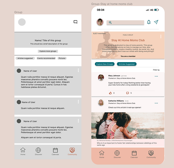
New Design and High Fidelity Prototype
This high-fidelity prototype was built in Figma and connected over 50 screens starting in the user flow for onboarding/signing in, then moving the user to their home page, where they can quickly go over their groups, articles saved, messages, friend list, coaching calendar, etc.
This prototype contains interactive links that allow the user to proceed forwards and backward within the sequence, and the embedded cues for user navigation are indicated.
The link to the prototype can be found below.

Accessibility Considerations

Takeaways

Next Steps:
